

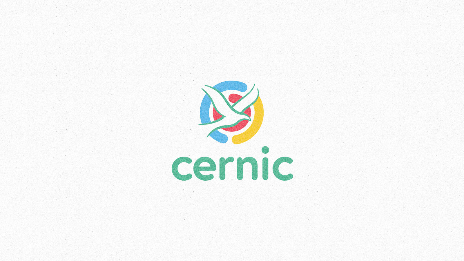
CERNIC
Cacoal Child Neurological Rehabilitation Center
Cacoal Child Neurological Rehabilitation Center
_______
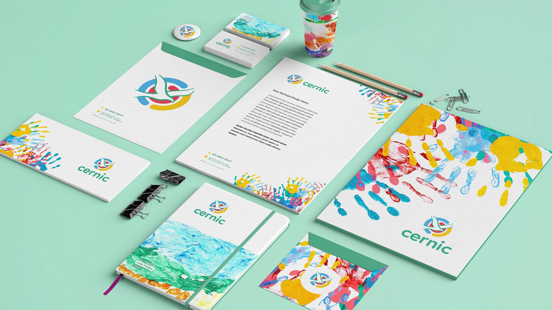
Brand Redesign Project
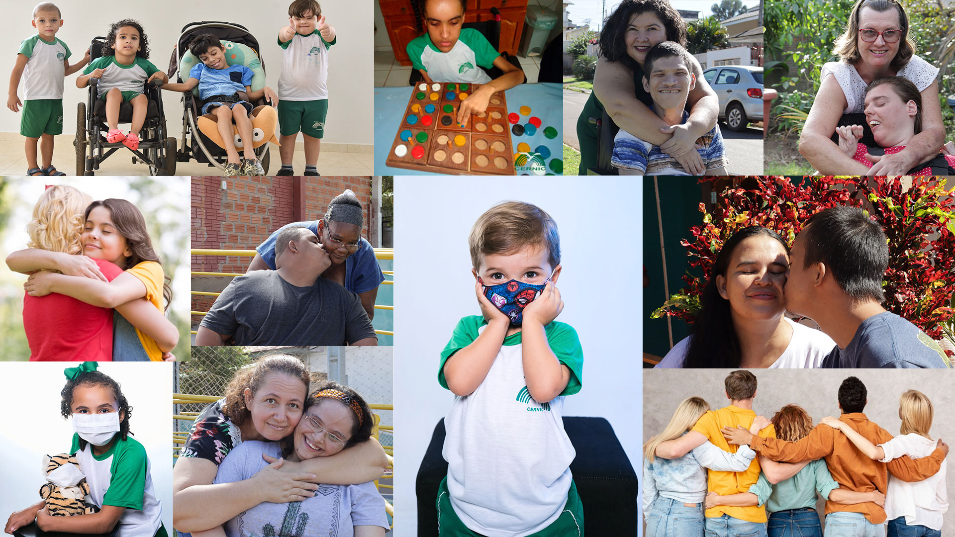
About: Cernic is here to show that special people can indeed have a voice in society, they can, through different paths and challenges, have their freedom, freedom that impacts society, through study, work and living.
Cernic is there to say it's possible, we believe.
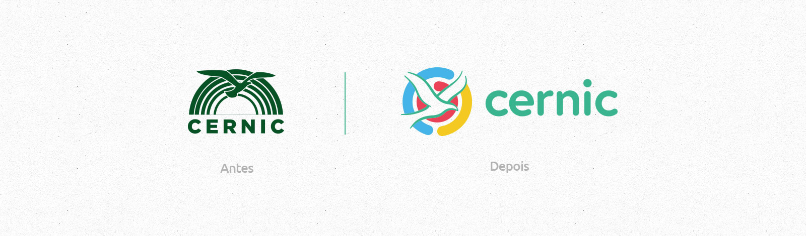
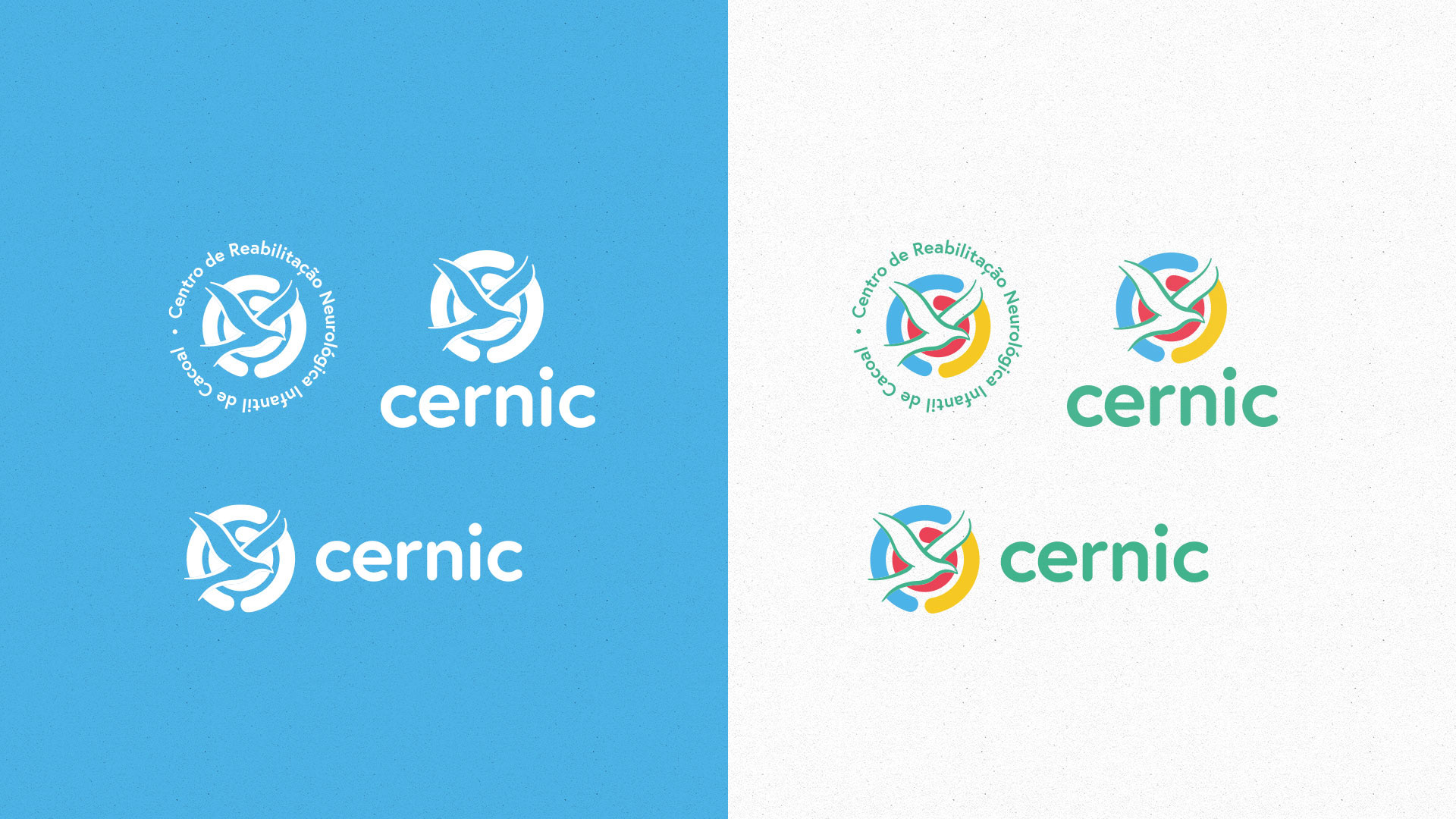
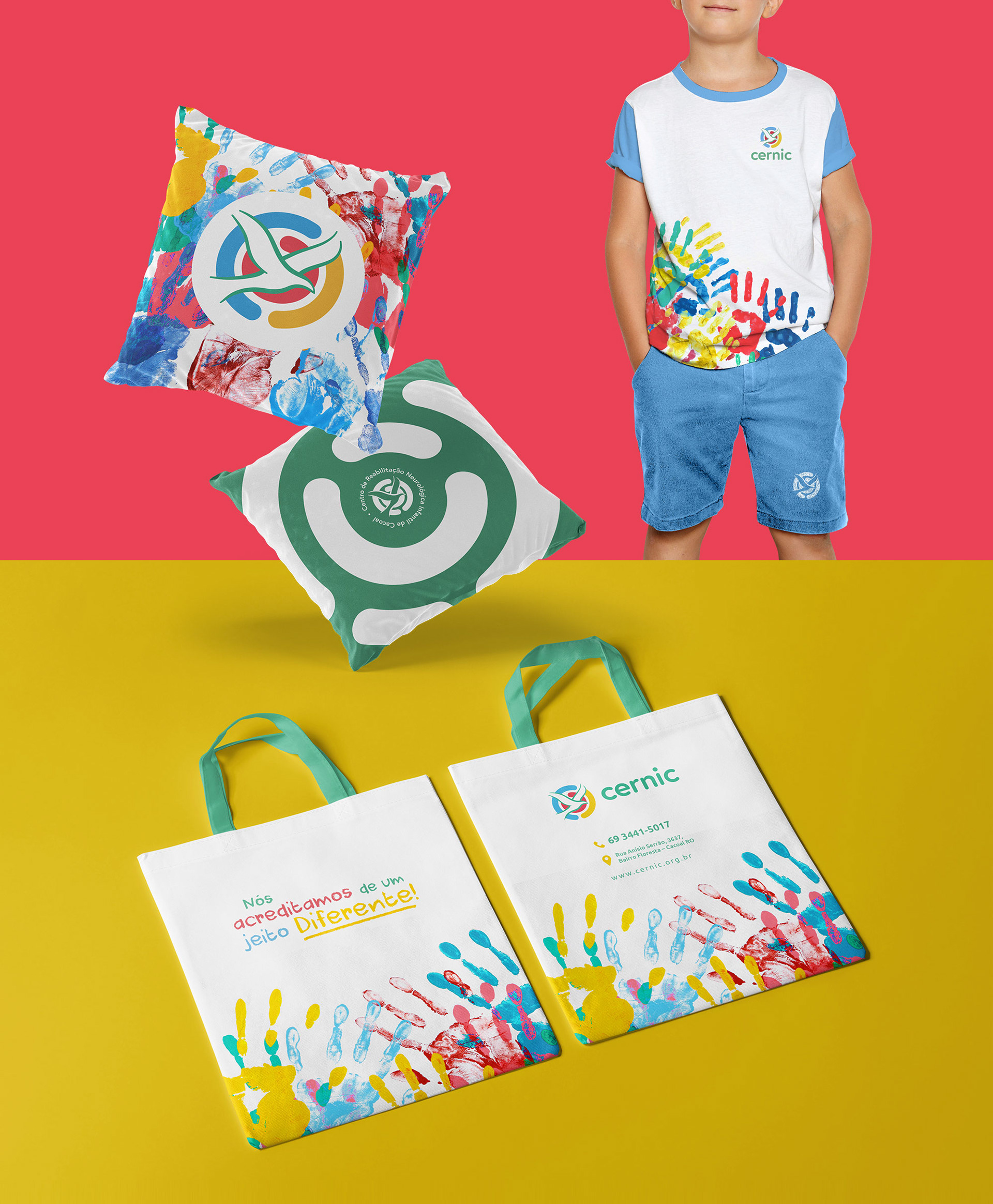
The main challenge was to build a new visual identity that would truly represent Cernic, without losing the essence of many years of work in the region.
We managed to maintain the essence of the symbology present in the old symbol and use the graphic elements that are part of the brand's atmosphere in order to bring the restlessness we were looking for.
We managed to maintain the essence of the symbology present in the old symbol and use the graphic elements that are part of the brand's atmosphere in order to bring the restlessness we were looking for.

Depois de um processo de imersão para entender o que precisavamos transmitir as pessoas sobre o CERNIC, definimos três mensagens centrais a serem ditas.
After an immersion process to understand what we needed to convey to people about CERNIC, we defined three core messages to be said.
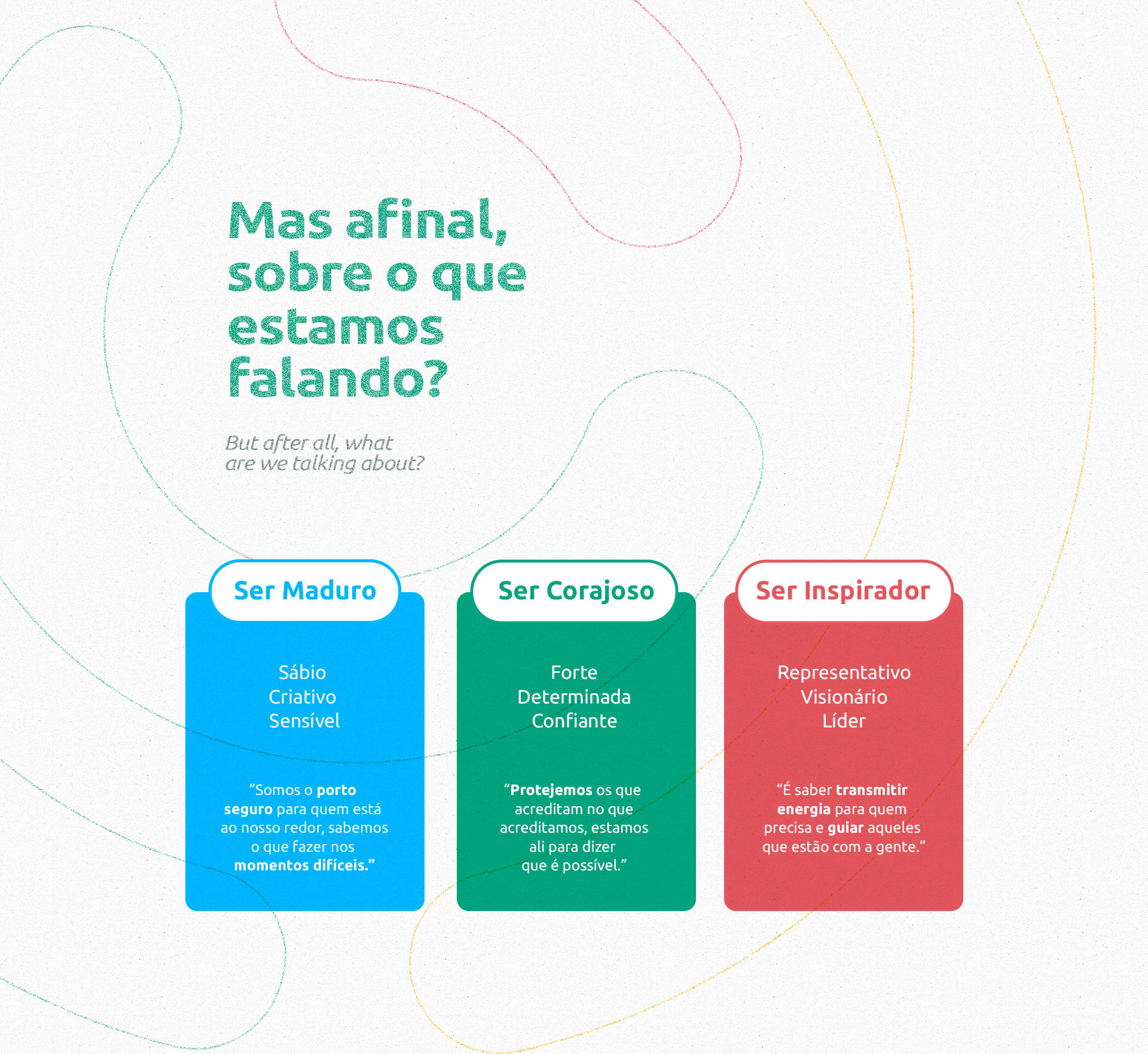
Being Mature: Wise, Creative and Sensitive.
We are the safe haven for those who are at our
around, we know what to do in difficult times."
Be Courageous: Strong, Determined and Confident.
"Let us protect those who believe in what we believe,
we are there to say that it is possible.”
we are there to say that it is possible.”
Be Inspiring: Representative, Visionary and Leader.
"It's knowing how to transmit energy to those
who need it and guide those who are with us."
who need it and guide those who are with us."

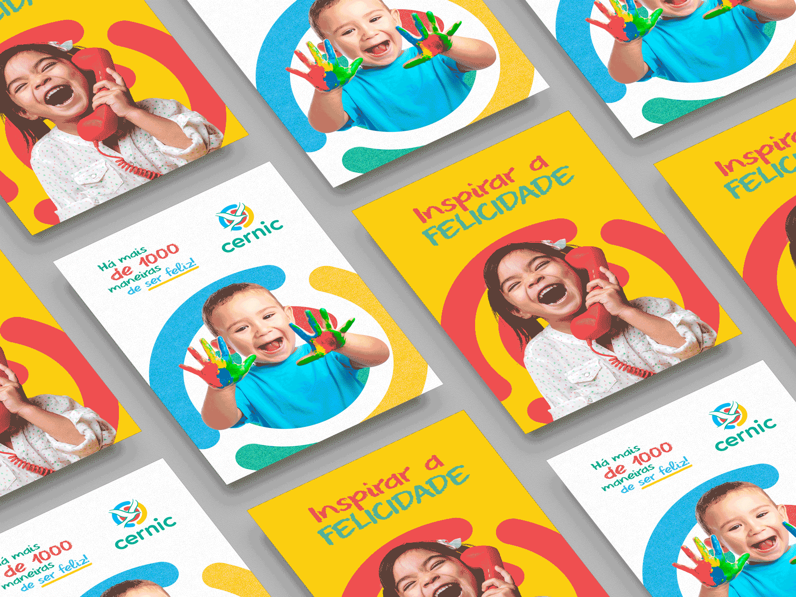
Se acreditamos, por que não mostrar as pessoas através do nosso exemplo?
Juntos podemos mostrar quem o cernic é!
If we believe, why not show people through our example?
Together we can show who cernic is!


Cliente: CERNIC - Centro de Reabilitação Neurológica Infantil de Cacoal.
Localização: Cacoal/RO
Projeto: Redesign de marca
Agência Define